
Authored by Loryn Lyle
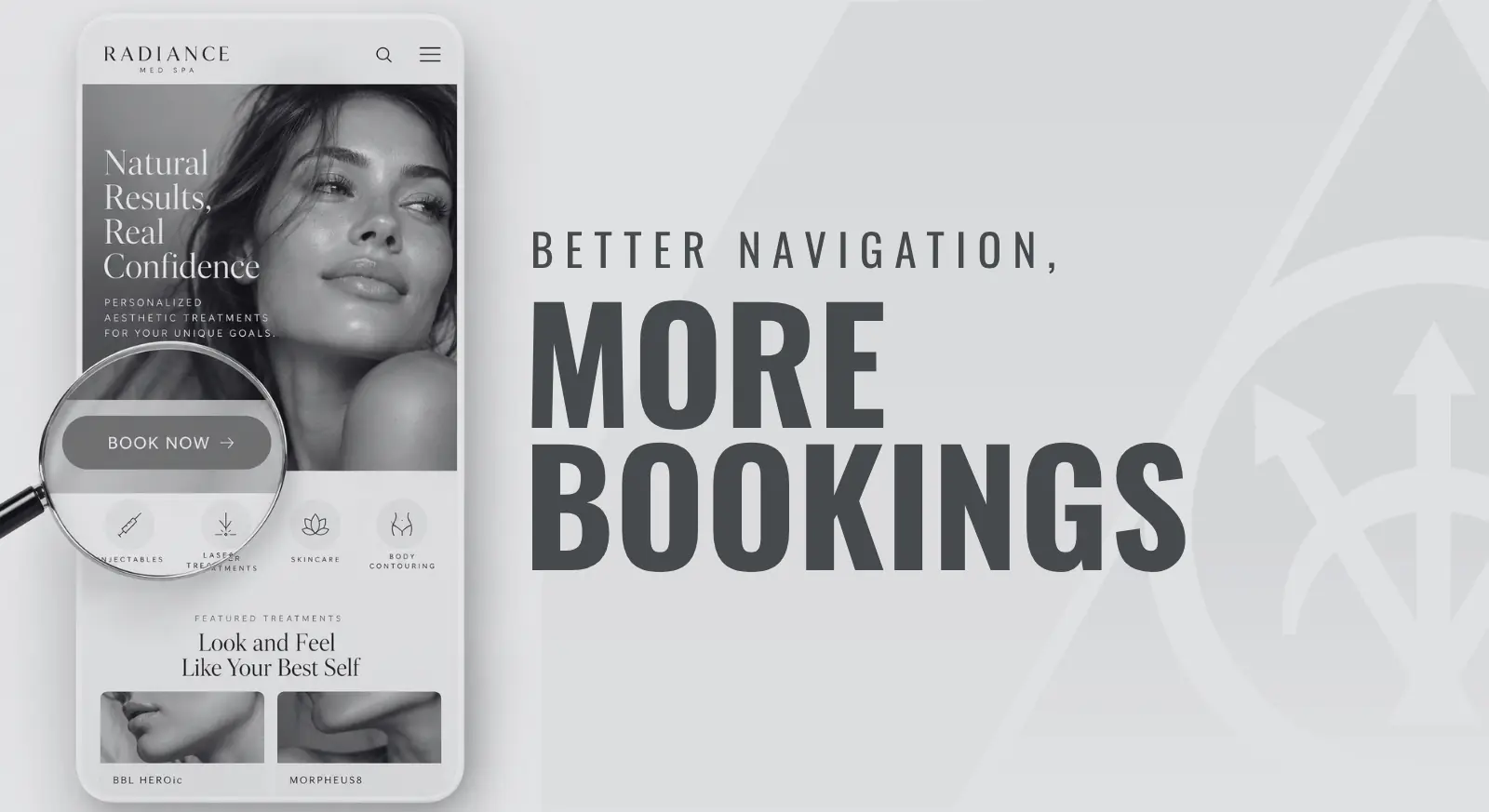
We recently made a small update to a client’s website that’s worth sharing. The “Book Online” link was buried in the page content instead of appearing in the main menu on desktop and mobile. We added it to the header across the site, while keeping the existing button at the top of the homepage.
The short answer: patients should be able to find a clear way to book or contact your practice from any page, especially on a phone. A quick check of your navigation, button labels and service pages can help you see where the path gets confusing.
Whether your practice focuses on aesthetics, ophthalmology, or longevity and wellness, it helps to look at your website as a new patient would. Your team already knows where everything is, but a potential patient is figuring it out for the first time.
You put time and money into bringing people to your website through paid ads, organic search, AI search and social media. Once they arrive, a few simple checks can help you see how easy it is to take the next step.
Can someone find the next step on a phone?
A good place to start is your homepage on your phone. Before you scroll or open the menu, take a look at what is actually visible. Can you find a clear way to book, request an appointment or contact the practice?
Then open the mobile menu. The appointment or contact option should be easy to recognize. Check whether a chat bubble, promotion or cookie banner covers it. A button can be present on the page and still be difficult to use.
It’s worth checking the menu even when you already have a booking button on the homepage, as we found with that recent client update.
What if they land on a service page first?
The homepage is only one starting point. Try going directly to a service page, such as Botox, LASIK or breast augmentation, and imagine it’s the first page you’ve seen. After reading about the service, can you find the next step without returning to the homepage?
Visitors may arrive from an ad, a search result, a link in an AI answer or a social post. Those links can take them straight to a specific treatment or landing page.
Check a few of those entry points. Keep the main booking or contact option consistent across the site, and place a relevant next step within the service page itself. If someone is ready to ask about LASIK, for example, the path to requesting a consultation should make sense from that page.
Does the button say what will happen?
Once the next step is easy to find, take a look at how it’s described. “Book Online,” “Request an Appointment” and “Contact Us” set different expectations, so each label should match the page it opens.
- Use “Book Online” when visitors can choose an available appointment and complete the booking process.
- Use “Request an Appointment” when they submit their information and wait for your team to arrange the visit. Explain that step near the form.
- Use “Contact Us” when the destination offers a general way to ask questions or reach the practice.
If online booking is limited to certain services, providers or existing patients, a short explanation before someone gets deep into the process can save them some frustration. Include a clear alternative for everyone else.
Simple, familiar wording works well here. The goal is to help visitors feel confident about what will happen when they click.
Do the links work the way you expect?
While you’re looking at the buttons, try them on your phone and then on a desktop. Does each one open the correct form, booking system or contact page? If you have multiple locations, is it clear which office the visitor is contacting?
Open the form and review the fields and instructions. Can you read the labels and move through the page without awkward zooming or scrolling? If a booking tool opens on another website, check that the practice name and next steps still make sense.
For a phone link, confirm that the correct number appears, then cancel before placing the call. Stop before sending a form or reserving an appointment. If a full submission test is needed, coordinate it with your team so it is identified as a test and does not create a false patient inquiry or take an appointment slot.
Where does someone unfamiliar with the site hesitate?
A fresh pair of eyes can be helpful here. Ask a friend who doesn’t regularly use your website to try the same task on their phone. Give them a service page and say, “Imagine you’re interested in this treatment. Show me how you would contact the practice or request an appointment.”
It can be tempting to help when you know exactly where to click. Give them a little room to try it on their own, and ask them to say what they’re looking for and what they expect to happen.
Watch where they pause, scroll past a link or choose a route you didn’t expect. Ask what made that step unclear. Their hesitation gives you something specific to review with your website team.
What should you check after a website update?
To make this easier to revisit, keep a short checklist for the next time your menu, page layout, forms or booking software changes:
- Check the homepage and a few important service pages on mobile and desktop.
- Find the booking or contact option from each page.
- Confirm that button labels match the action available.
- Open each destination and check the form, location and phone number.
- Ask someone unfamiliar with the site to try it without coaching.
Once the first step is clear, review what happens after someone reaches out. Troy Cole’s guest article on the Zeiss lead-conversion study covers that next stage, including confirmations and team follow-up.
If you’re unsure what to change, talk with SILVR. We can help you review your website’s navigation and booking path so prospective patients have a clearer way to take the next step.
About the author
Loryn Lyle is the founder of SILVR Agency and has more than 20 years of experience in digital marketing for medical practices. Her work spans SEO and AI search optimization, website user experience, and patient conversion.